
As a data visualization enthusiast always hungry for pushing boundaries, I remember my excitement when first discovering Tableau Extensions (it was TabCSS). Whether you’re an adventurous Tableau developer eager to explore uncharted territories, or you’ve simply reached the limits of native features and still have unmet requirements – Extensions might be for you.
I’ve been there too, wondering if Extensions were worth the learning curve. That is why I decided to dive deep into their potential and share my findings with you. No marketing fluff, just practical insights from one curious developer to another. Let’s explore together what Extensions can (and cannot) do for your visualizations, and when they’re actually worth the extra effort.
Through this guide, I will walk you through my hands-on research and experimentation with Extensions, hoping to save you some time and perhaps inspire your next data visualization.

What are Extensions in Tableau?
Extensions are powerful tools that allow you to add custom functionality to your Tableau workbooks. At their core, they’re executable web applications that integrate seamlessly into Tableau’s ecosystem. These extensions can range from simple enhancements to complex features, and many are developed by external companies or Tableau experts.
However, there’s a key consideration: extensions must be executable both locally on your machine and on Tableau Server to function properly.
How are Extensions hosted in Tableau?
Tableau supports two ways to host extensions, each with its own level of access and security:
- Network-Enabled: These extensions are hosted on web servers, either within your local network or externally. They have full access to the web, allowing them to interact with external APIs, databases, or services. While powerful, they require careful management to ensure security and performance.
- Sandboxed: These extensions run in a protected environment and are hosted by Tableau. Unlike network-enabled extensions, sandboxed extensions have no access to external web resources or services. This isolation makes them more secure and stable, as they cannot interact with anything outside the sandbox.
Why focus first on Sandbox Extensions?
Picture this: you’ve just built a Tableau dashboard, and now you want to add a custom feature—something unique that takes your data storytelling and user experience to the next level. You’ve heard about Tableau extensions, but you’re hesitant. What if the extension crashes your workbook? Or worse, what if it compromises your data security?
Enter Sandbox Extensions.
Sandbox extensions are a special category of Tableau extensions that operate in a controlled, secure environment called the Tableau Sandbox. Think of the sandbox as a protective bubble: it allows extensions to access and interact with data in your dashboard, but it completely isolates them from the outside world. This means a sandboxed extension can pull data, perform calculations, and even create custom visuals—but it cannot send that data outside the sandbox or interact with external web resources.
For example, imagine you’re using a sandboxed extension to build a dynamic, interactive map. The extension can access your dashboard’s data to plot locations and display insights, but it won’t be able to share that data with an external server or API. This ensures your data stays secure, your workbook remains stable, and your IT team stays happy.
Here’s why sandbox extensions deserve your attention:
- Security: Sandbox extensions are isolated from the core Tableau environment, reducing the risk of errors or security breaches.
- Customization: They allow you to experiment with custom functionality without affecting your production workbooks.
- Innovation: Sandbox extensions are often the testing ground for cutting-edge features and integrations, making them a playground for creativity.
Common use cases for sandboxed extensions:
- Basic UI elements
- Simple calculations
- Custom formatting
- Static visualizations
- Parameter controls
- Navigation menus
Hands-On Guide: Exploring Sandbox Extensions with Examples
Ready to dive into the world of sandbox extensions? Below, you’ll find a series of simple examples to help you get started. Each example includes step-by-step instructions and a link to a Tableau Public workbook where you can explore the dashboard and see the extension in action.
Example 1: TabCSS
What You’ll Learn: Discover how to customize Tableau elements and containers using CSS classes from popular frameworks like Bootstrap and Tailwind.

For more details, visit:
- TabCSS on Tableau Exchange
- Introducing TabCSS, Your Shortcut to Styled Backgrounds in Tableau by Rody Zakovich – Starschema, TabCSS Developer.
Steps to Follow:
- Add Your Visualization to the Dashboard
- Start by dragging your desired visualizations onto the dashboard.
- Add the TabCSS Extension
- Drag the TabCSS extension object from the “Extensions” pane onto your dashboard.
- Pro Tip: Hold down the Shift key while dragging to place it as a floating element.
- Adjust the Layout Hierarchy
- On the left-hand panel, navigate to the Layout section.
- Under Item Hierarchy, locate the TabCSS element.
- Click on the TabCSS element and use the Send to Back option to ensure it sits behind your elememts.
- Resize the TabCSS Element
- Carefully adjust the dimensions of the TabCSS element to match the exact size of your dashboard. Why is this important? This ensures the CSS styles are applied uniformly across the entire dashboard.
- Apply CSS Style by Renaming Elements
- Identify the containers or elements you want to style (e.g., charts, text boxes, container).
- Rename them by adding a pipe delimiter “|” followed by the desired CSS class names.
- Example: Rename a visualization element to ‘
barchart |border border-5to apply a 5px’ border using CSS.
- Example: Rename a visualization element to ‘
- Some supported CSS Classes:
- Test and Refine
- Tweak the CSS code as needed to achieve your desired look and feel.
- Pro Tips for Padding:
- For outer padding, avoid adding it directly to elements. Instead, use blank objects as spacers.
- For inner padding, adjust it within the elements to achieve the perfect spacing.
Tableau Public Workbook: Tableau Extended: TabCSS Example
Note: Unfortunately, Tableau Public (online) does not currently support the TabCSS extension. To see it in action, download the workbook and open it in Tableau Desktop ot Tableau Public.
Example 2: Bar Race Chart
Remember Hans Rosling’s famous storytelling video? If not, take a moment to watch it: Hans Rosling’s 200 Countries, 200 Years, 4 Minutes – The Joy of Stats – BBC
With this Bar Race Chart extension you could bring that same dynamic and animated storytelling to your dashboards.
What You’ll Learn: Create animated bar charts that progress through a range of periods, enabling users to pause, restart, or browse through the data at their own pace. Perfect for showcasing trends over time in an engaging and interactive way.

For more details, visit:
Steps to Follow:
- Prepare Your Source Sheet:
- Drag the fields you want to use for Value, Time Period, and Items to the Details mark in your worksheet.
- Add the Visualization to the Dashboard:
- Drag your sheet onto the dashboard as a floating element (hold Shift while dragging).
- Hide the Source Sheet:
- Resize the sheet to 1×1 pixels to make it invisible on the dashboard.
- Add the Bar Race Chart Extension:
- Drag the Bar Race Chart onto the dashboard.
- Configure the Extension:
- Select your source sheet and map the fields to their respective pairs (e.g., Value, Time Period, Items).
- Customize the Bar Race Chart:
- Adjust settings like Tick Duration and Delay Duration to control the animation speed and timing.
Tableau Public Workbook: Tableau Extended: Bar Race Chart Example
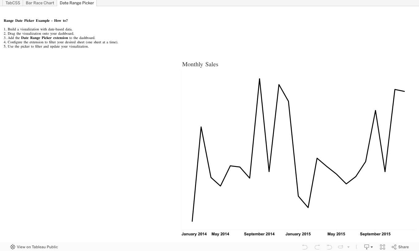
Example 3: Date Range Picker
What You’ll Learn: Add a calendar-based date range picker to your Tableau dashboards, allowing users to select specific time periods.
For more details, visit:
Steps to Follow:
- Build Your Visualization:
- Create a worksheet with the data you want to filter by date.
- Add to Dashboard:
- Drag your visualization onto the dashboard as a floating or tiled element.
- Add the Date Range Picker Extension:
- Drag the Date Range Picker extension from the Extensions pane onto the dashboard.
- Configure the Extension:
- Select the sheet you want to filter (note: the extension currently works for one sheet at a time).
- Filter Your Visualization:
- Use the date range picker to filter your data and see the visualization update dynamically.
My Personal Take:
I found the UI design of the Date Range Picker to be less than ideal for most use cases. The calendar occupies a significant amount of space on the dashboard and doesn’t automatically hide after selecting a date, which can clutter the interface. Additionally, the extension fails to automatically set the minimum and maximum range values based on your date field, potentially confusing users who expect it to dynamically adjust to the data.
Given these limitations, I wouldn’t recommend this extension
Tableau Public Workbook: Tableau Extended: Bar Race Chart Example
Note: The content of this blog post has been enhanced with the assistance of Generative AI tools while maintaining my authentic voice and technical expertise. I believe in transparency about AI usage in content creation

Leave a comment